Motion Assets
There are four categories of motion. Each one has a unique approach
with typography, logo, and imagery.
Motion principles

While our motion can be playful and expressive there is always a clear purpose behind all motion. Whether we are revealing content, emphasising a brand element, or adding to the product experience - we always bind motion to an outcome.

Our motion helps take the brand assets and elevates them to have a distinct personality. Whether we are illustrating the behaviours of our box icon, adding a unique feel to everyday product assets, or revealing the relationship between our intersecting shapes, We take the everyday and make it feel magical.

Always select one brand asset to be the singular hero in motion, paired with confident and smooth pacing to our brand assets. This creates a feeling of simplicity and confidence in our motion style.
Motion assets
There are four categories of motion. Each one has a unique approach with typography, logo, and imagery.
There are four categories of motion. Each one has a unique approach with typography, logo, and imagery.
Logo

Shapes
Typography
Transitions
Logo lockup
Our hero logo is our primary animation. This appears in TVC, App
launch and any other key brand moments.
Our hero logo is our primary animation. This appears in TVC, App
launch and any other key brand moments.
Logo - simple
Our simple logo animation is when the logo needs to appear with
multiple other brand elements and a simpler animation is required.
Our simple logo animation is when the logo needs to appear with
multiple other brand elements and a simpler animation is required.
Icon Behaviours
Our icon behaviours show off the personality of our box icon. This is
appropriately used to enhance the app experience and elevate
interactive brand moments.
Our icon behaviours show off the personality of our box icon. This is
appropriately used to enhance the app experience and elevate
interactive brand moments.
Shape
Our graphic shapes interact with multiple different brand elements
from product, typography and our logo mark. Each shape has its own
unique way it moves in motion.
Our graphic shapes interact with multiple different brand elements
from product, typography and our logo mark. Each shape has its own
unique way it moves in motion.
Shape and logo
When using our graphic shapes in motion with our logo, we always
use the simple logo to create a more fluid motion composition.
When using our graphic shapes in motion with our logo, we always
use the simple logo to create a more fluid motion composition.
Shape and type
Our graphic shapes can intersect typography in motion. Be sure to
only use this interaction on short and singular headlines.
Our graphic shapes can intersect typography in motion. Be sure to
only use this interaction on short and singular headlines.
Shape and Product
Our shapes move to reveal product through the intersection between
the two shapes. Our product photography has a lower frame rate to
give a sense of personality to objects.
Our shapes move to reveal product through the intersection between
the two shapes. Our product photography has a lower frame rate to
give a sense of personality to objects.
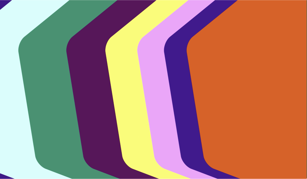
Shape masks
Shape masks work similarly to our transitions, where our masks
move with a layered effect that gives a sense of odyssey and as it
reveals new content.
Shape masks work similarly to our transitions, where our masks
move with a layered effect that gives a sense of odyssey and as it
reveals new content.
Typography
Our typography animates in a smooth and swift manner. Able to be a
supporting motion assets while other graphic elements take centre
stage.
Our typography animates in a smooth and swift manner. Able to be a
supporting motion assets while other graphic elements take centre
stage.
Transitions
Our transitions allow us to double down on the odyssey experience
of our brand. Giving a celebratory sense of journey one piece of
content to the next.
Our transitions allow us to double down on the odyssey experience
of our brand. Giving a celebratory sense of journey one piece of
content to the next.