Colour
Color is one of the core elements of our brand. Our distinctive palette is bold and expressive while also being flexible to suit a wide variety of needs.
Primary colours
Our primary brand colour is orange while our primary colour combination is orange and light blue.
Our primary brand colour is orange while our primary colour combination is orange and light blue.

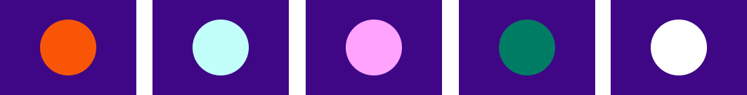
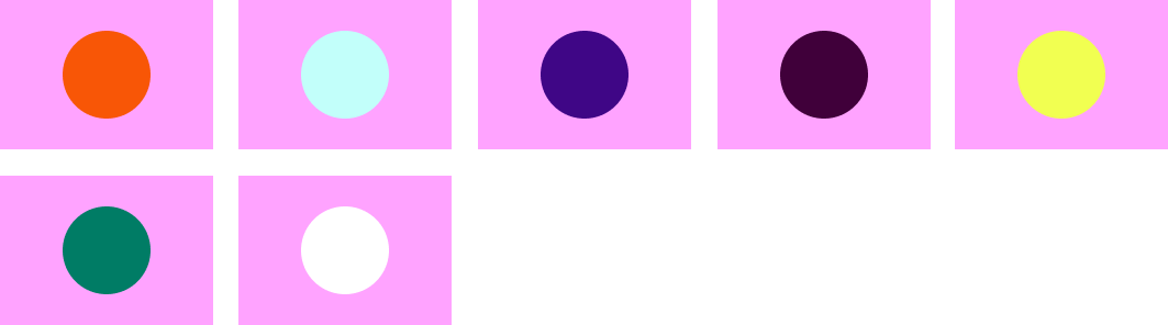
Secondary colours
Our secondary palette includes purple, dark blue, pink, green, yellow and black and white.
Our secondary palette includes purple, dark blue, pink, green, yellow and black and white.

Specifications
Each one of our colours have a HEX and RBG value for digital applications, and a PMS and CMYK value for print.
Each one of our colours have a HEX and RBG value for digital applications, and a PMS and CMYK value for print.
| 18px | 16px | |
|---|---|---|
| White text | Pass | Not legible |
| Maroon Text | Pass | Pass |
| Teal text | Pass | Not legible |
| Purple text | Pass | Not legible |
| 18px | 16px | |
|---|---|---|
| Maroon text | Pass | Pass |
| Orange text | Pass | Pass |
| Purple text | Pass | Pass |
| 18px | 16px | |
|---|---|---|
| White text | Pass | Pass |
| Orange text | Pass | Pass |
| Teal text | Pass | Pass |
| Pink text | Pass | Pass |
| 18px | 16px | |
|---|---|---|
| Maroon text | Pass | Pass |
| Purple text | Pass | Pass |
| Green text | Pass | Not legible |
| 18px | 16px | |
|---|---|---|
| Maroon text | Pass | Pass |
| Purple text | Pass | Pass |
| Orange text | Pass | Not legible |
| 18px | 16px | |
|---|---|---|
| White text | Pass | Pass |
| Maroon text | Pass | Not legible |
| Teal text | Pass | Not legible |
| Yellow text | Pass | Pass |
| 18px | 16px | |
|---|---|---|
| White text | Pass | Not legible |
| Maroon text | Pass | Pass |
| Teal text | Pass | Not legible |
| Purple text | Pass | Not legible |
| 18px | 16px | |
|---|---|---|
| Pass | Pass |
| 18px | 16px | |
|---|---|---|
| Pass | Pass |
| 18px | 16px | |
|---|---|---|
| Pass | Pass |
| 18px | 16px | |
|---|---|---|
| Pass | Pass |
| 18px | 16px | |
|---|---|---|
| Pass | Pass |
| 18px | 16px | |
|---|---|---|
| Pass | Pass |
| 18px | 16px | |
|---|---|---|
| White text | Pass | Not legible |
| Maroon text | Pass | Pass |
| Teal text | Pass | Not legible |
| Purple text | Pass | Not legible |
| 18px | 16px |
|---|
| 18px | 16px |
|---|
| 18px | 16px |
|---|
| 18px | 16px |
|---|
| 18px | 16px |
|---|
| 18px | 16px | |
|---|---|---|
| White text | Pass | Not legible |
| Maroon text | Pass | Pass |
| Teal text | Pass | Not legible |
| Purple text | Pass | Not legible |
| 18px | 16px |
|---|
| 18px | 16px |
|---|
| 18px | 16px |
|---|
| 18px | 16px |
|---|
| 18px | 16px |
|---|
UI tints specifications
We also have a set of tints that we use exclusively in our UI.
We also have a set of tints that we use exclusively in our UI.
Usage proportions
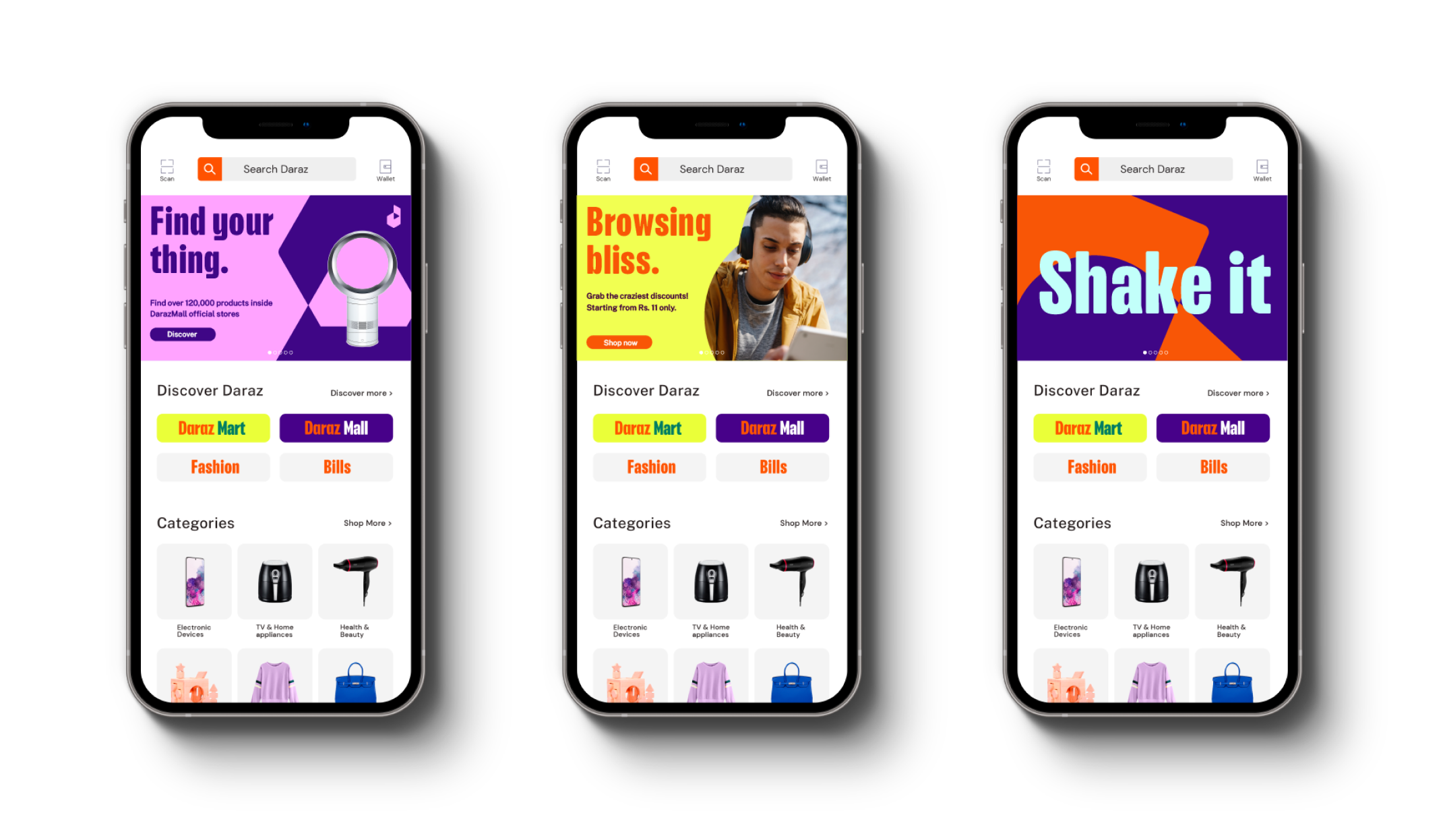
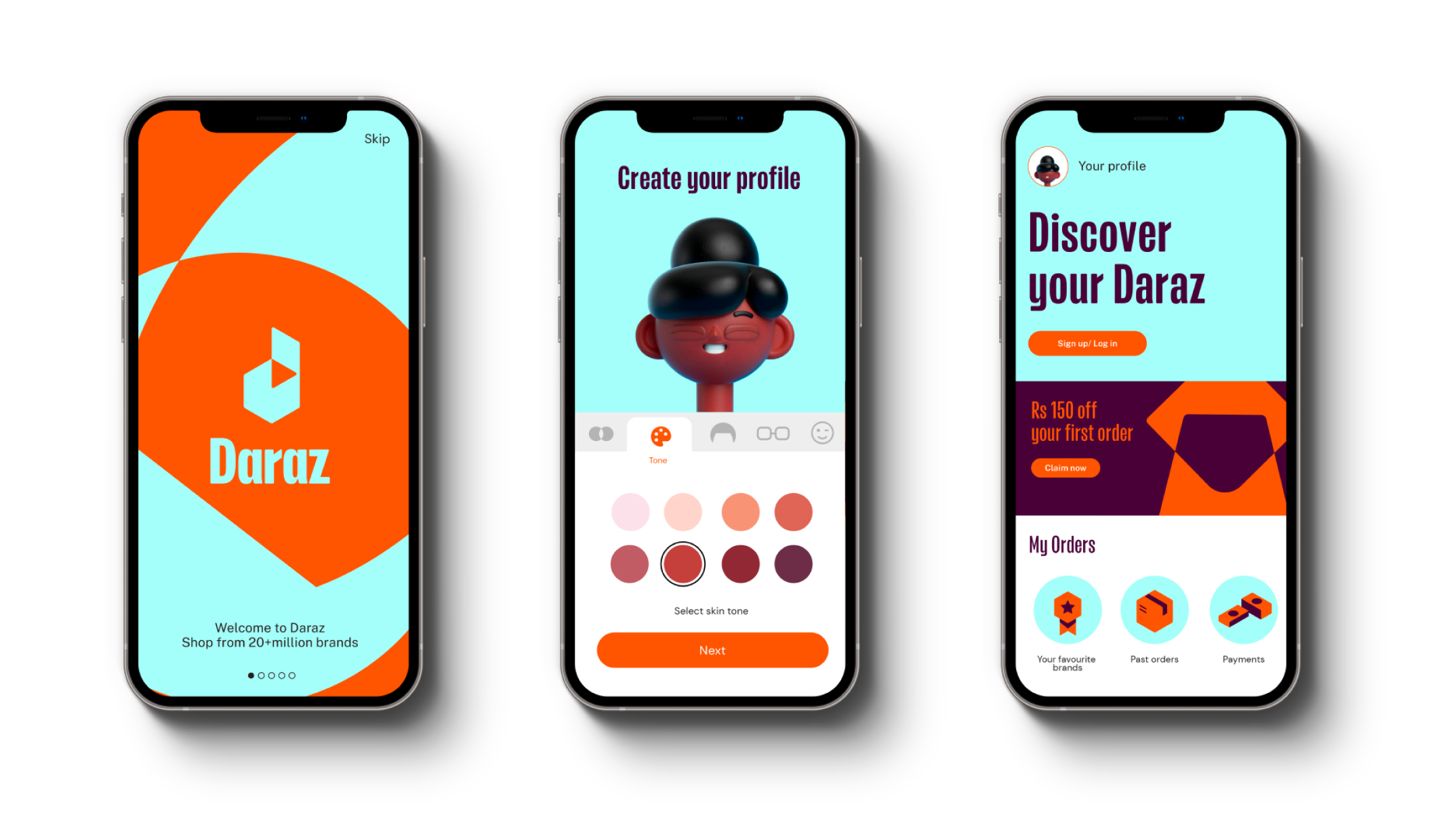
The Daraz palette is broad so we should always consider the proportions of colour that we use. In key brand moments we should always showcase the Daraz orange and teal combination first, while secondary colours are suitable to create variety in advertising, marketing material and other communications.
The Daraz palette is broad so we should always consider the proportions of colour that we use. In key brand moments we should always showcase the Daraz orange and teal combination first, while secondary colours are suitable to create variety in advertising, marketing material and other communications.
Corporate communications
The following tints may be used for corporate communications such as powerpoints when dealing with large groups of text or infographics.
The following tints may be used for corporate communications such as powerpoints when dealing with large groups of text or infographics.

Ways we use colour
For a more comprehensive understanding of how we use colour please refer to these sections of the guidelines.
For a more comprehensive understanding of how we use colour please refer to these sections of the guidelines.

In layout

In logo
In illustration

In typography

In system shapes
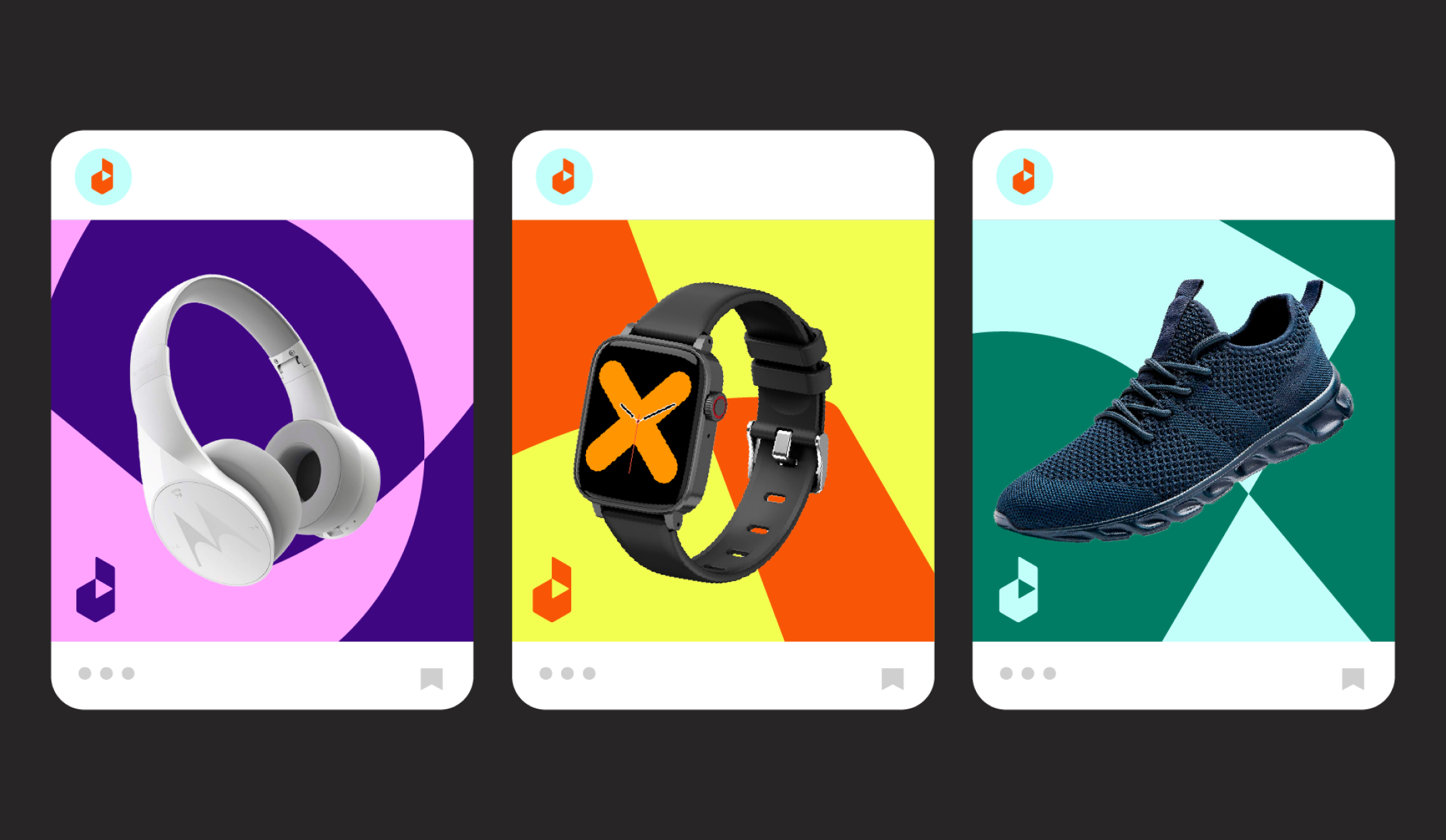
Colour combinations
Orange and teal are our primary colour combination. It is the leading colours that represent our brand.
Orange and teal are our primary colour combination. It is the leading colours that represent our brand.


These are our supporting colour combinations, they can be used across all of our other brand assets such as typography, graphic shapes, icons and illustrations.


Misuse

Avoid the Dark Blue and Yellow colour combination.

Avoid any other colour combinations that are not in the style-guide.

Do not create new colours for the brand.

Avoid using purple for large background areas.

Avoid using dark blue for buttons.

Do not use tints for text or graphic elements.

Do not place tints on top of tints.

Do not use light tints on white

Do not use grey for graphic elements
In use
The following examples show effective applications of our colours
The following examples show effective applications of our colours