Logo
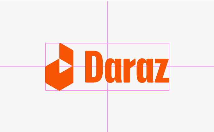
Our logo is a bold and distinct representation of Daraz . To make sure our logo looks its best, we’ve defined a clear space, placement and its relation to other content.
Logo


Lockups
Our logo has two lockups, a horizontal and a vertical option.
Our logo has two lockups, a horizontal and a vertical option.

Horizontal lockup

Vertical lockup
Icon
Our box icon represents the endless possibilities of Daraz.
It is carefully crafted to simultaneously resemble an open box and a lowercase d.
Our box icon represents the endless possibilities of Daraz. It is carefully crafted to simultaneously resemble an open box and a lowercase d.

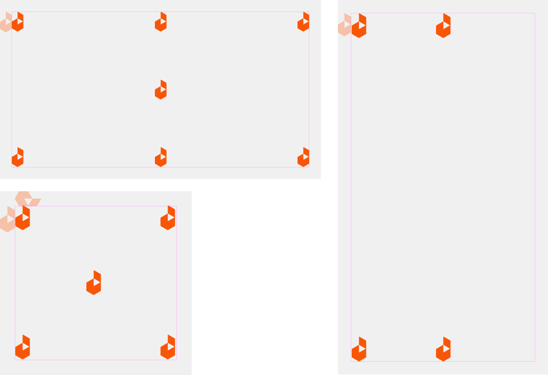
Clearspace
Our logo has clearspace to ensure legibility and impact. For our lockups we measure this using the width and height of the letter a in our wordmark.
Our logo has clearspace to ensure legibility and impact. For our lockups we measure this using the width and height of the letter a in our wordmark.

Partnership lockup
Aligning partnership logos should follow clear space rules. The partner logo should never be bigger than our logo.
Aligning partnership logos should follow clear space rules. The partner logo should never be bigger than our logo.
.svg)
Scale
Our logo has been crafted to ensure legibility and consistency at different sizes. The smallest size the logo should be used is at 32px height (168px width).
This excludes our favicon version which is to be used at 16px height.
Our logo has been crafted to ensure legibility and consistency at different sizes. The smallest size the logo should be used is at 32px height (168px width). This excludes our favicon version which is to be used at 16px height.

Colour


Positive logos


Positive logos against white


Positive logo against coloured background combinations
-1644465588.svg)
.svg)

Negative Logos


-1644466247.svg)
-1644466258.svg)
Positive logo against coloured background combinations
Placement
Our logo can be used in a number of different positions in layout. Typically our horizontal lockups are left or right aligned while our vertical lockups can be centred.
Our logo can be used in a number of different positions in layout. Typically our horizontal lockups are left or right aligned while our vertical lockups can be centred.


Centre alignment
When aligning the logo to the centre, treat the logo and the wordmark as one element. This applies both vertically and horizontally.
When aligning the logo to the centre, treat the logo and the wordmark as one element. This applies both vertically and horizontally.
Icon
In small format when our logo lockup can't perform well, we use our icon to ensure the best legibility and recognition.
In small format when our logo lockup can't perform well, we use our icon to ensure the best legibility and recognition.
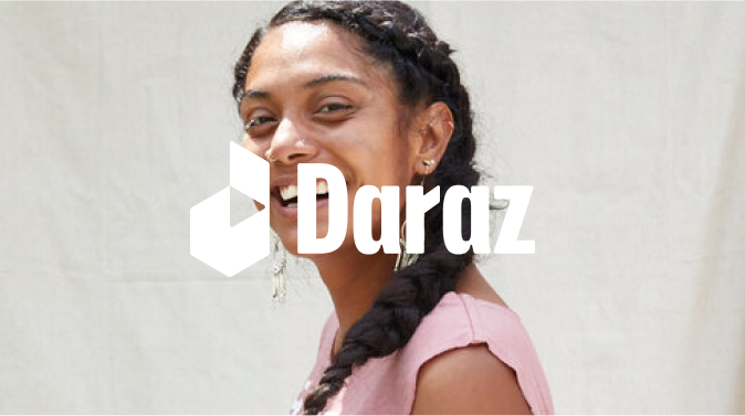
Logo on photography
To ensure the best legibility with photography, we can overlay a colour layer of Purple or white on top of the image at 10 - 20% opacity
To ensure the best legibility with photography, we can overlay a colour layer of Purple or white on top of the image at 10 - 20% opacity

No colour layer
.jpg)
15% opacity layer using purple
Colour contrast and photography
To ensure the best legibility with photography, ensure to use colour for the logo that has a strong visual contrast. Avoid placing the logo on visually busy parts of the background.
To ensure the best legibility with photography, ensure to use colour for the logo that has a strong visual contrast. Avoid placing the logo on visually busy parts of the background.

5% opacity layer using purple

10% opacity layer using purple

15% opacity layer using purple
Misuse
We want our identity to always look its best. Avoid the following treatments when using our logo and wordmark.
We want our identity to always look its best. Avoid the following treatments when using our logo and wordmark.
Do not type out logo
Do not stretch logo
.png)
Do not place drop shadow on logo
.png)
Do not set logo in non-brand colours
.png)
Do not scale the box icon in the logo
.png)
Do not set logo in colours other than the specified combinations in the style guide
Do not place logos over faces

Do not use colours that make the logo illegible
.png)
Do not place the logo in visually complex areas.
In use
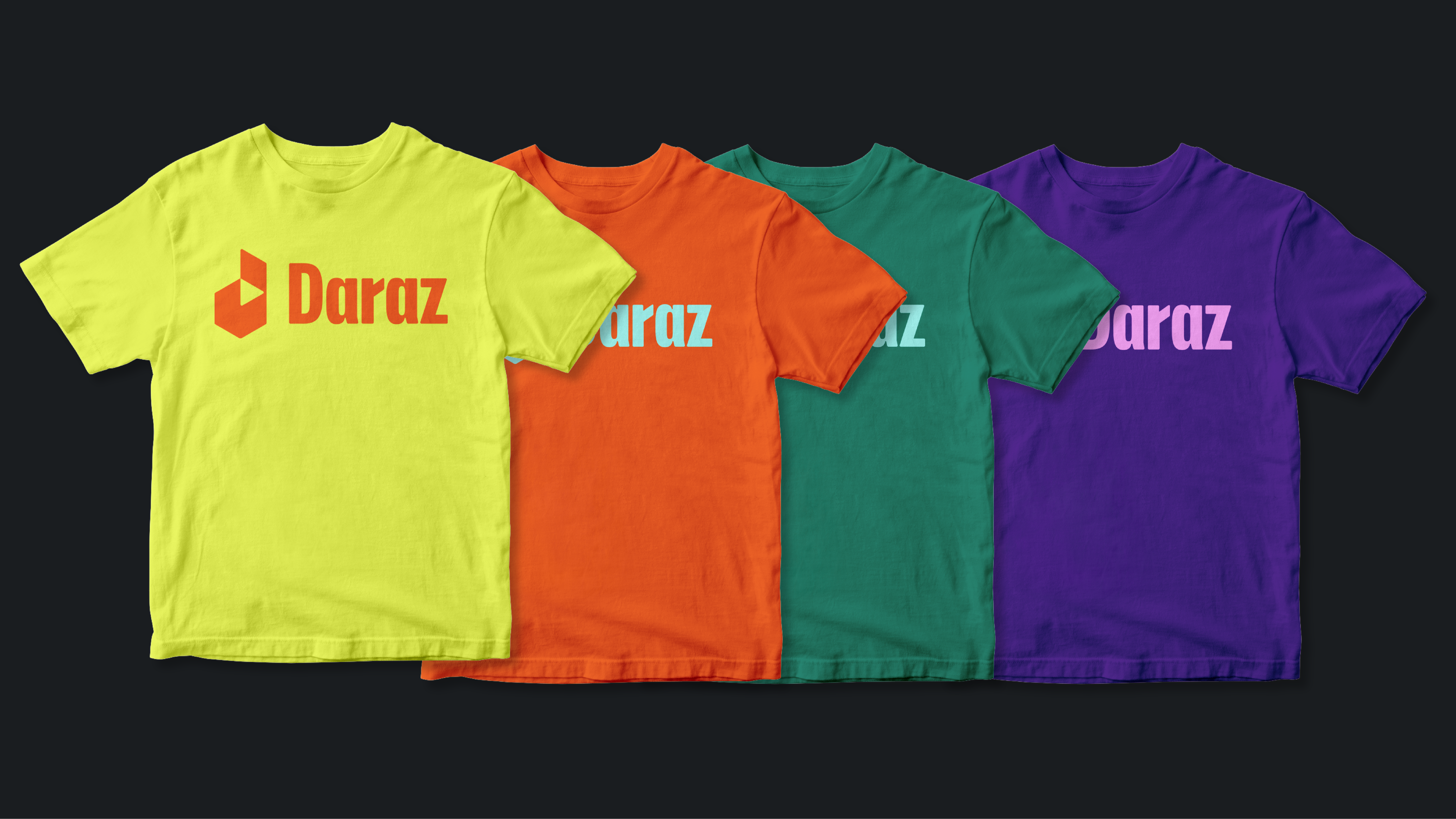
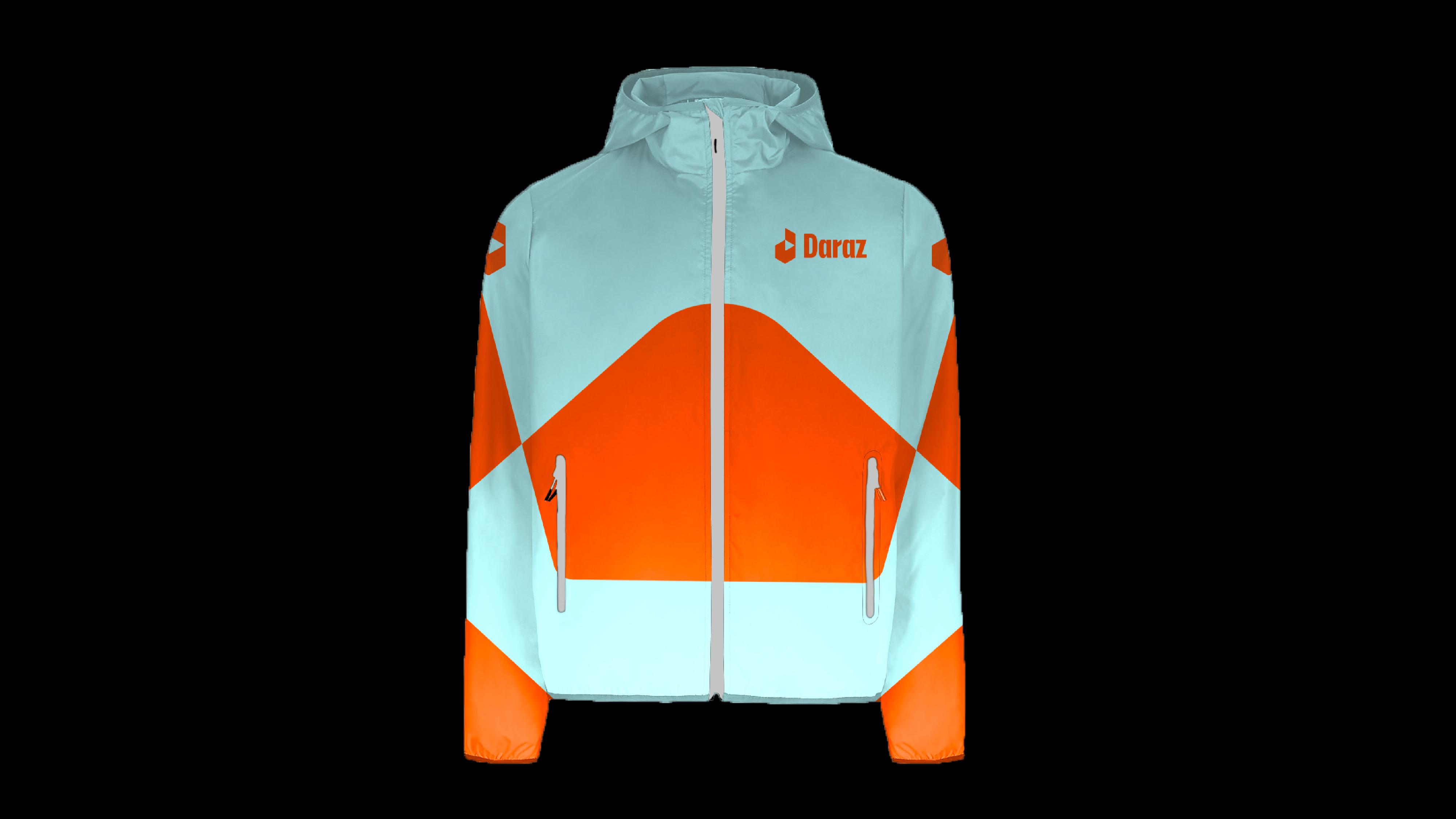
The following examples show effective applications of our logo.
The following examples show effective applications of our logo.